
The MLA Style Center
Role: UX, UI, and Visual Design
Overview
This website was developed as a companion for MLA style products, specifically the latest edition of the MLA Handbook. In addition to its role as an official online resource supporting students and teachers learning about the style, the goals of the website are to increase sales of the book and extend the MLA brand. I worked with a small team to research our users, organize content, sketch, and mock up the site. We are currently collecting feedback and user data as we refine the design and add features.

User Experience
We kicked off this project by gathering requirements from stakeholders, cataloging the type of content the site would feature, looking at competitive websites, and developing personas. We knew the average user would fall into one of four categories: a student, professor, researcher, or writing enthusiast. Originally we thought the best way for users to navigate the content was for them to enter the site through a portal based on each persona.

As the content solidified, we realized that many of the users’ needs overlapped, so having four separate paths no longer made sense. The content was wide and not deep, so a tile-based approach was most suitable for navigation. We switched gears, began sketching new wireframes, and developed an interactive prototype.

After working out the overall architecture, we moved on to designing the main features. A major goal of the site is to teach the new MLA style, so our job was to translate the process of creating a works-cited list as described in the printed handbook to the online environment. In the book, after a description of how the process works, a reader follows examples of source materials that are numbered to coordinate with their entry in the works cited list. We had to figure out a way to present this in HTML, without the addition of the accompanying text and with responsivity. We worked through multiple sketches and of how to present the citation template.

After many iterations, we came up with a simplified citation framework and method of presenting the source imagery. Making it responsive was especially challenging. We wanted to maintain the integrity of the experience and not take a shortcut by making it all image based, but by flowing all of the content in a single column, the user would have a hard time connecting the source material to the numbered template.
The final solution was to create an overlay that the user could engage by touching the eye icon on the citation template. This made it easy for the user to see on a small screen how the source material fit into the template.

With addition of more interactivity for when a user engages with the text fields and source materials, this feature has the potential of being a powerful and fun learning tool.
After the site launched and we began gathering feedback, we prioritized new features along with design and development tweaks. One significant update we’re working on is the navigation and design of the FAQ page. We’ve been getting a lot of question submissions and have found that it is difficult for users to sift through the long list without a better typographic hierarchy in place along with a specific search function. Our first thought was to add a faceted search and accordion hide/reveal feature to the questions and answers, but then decided to pull back and start with a simpler solution. We’re adding search box that applies specifically to the FAQ section of the site. To organize the long list of questions, we are adding an overhanging “Q” to indicate where each new question begins and then making the answer a clear link to a new page. Additionally, we are adding pagination to indicate to the user where they are in the long list of questions.

Visual and UI Design
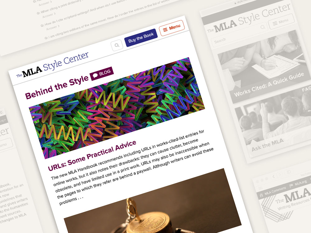
The goal for the visual design and interface elements was to coordinate with the graphics of the Handbook as well as the other MLA online properties. We chose the color palette by highlighting the colors that cross over from the MLA website to the rainbow graphics of the Handbook cover. Many of the UI elements, like the buttons and forms, were carried over from mla.org for brand consistency. The navigation, consisting of lists of links in the sidebar and a dropdown menu in the header, is a work in progress. As posts have been added to the site, we’ve discovered that many of the titles are too long and hard to read in the sidebar. We are currently iterating on the design to improve it, and are in the process of adding custom post fields in order to shorten titles for display in the sidebar and fine-tuning the line and paragraph spacing. Future improvements will include developing ways to hide and expand content and organize the links.
