
Modern Language Association Website
Role: UX, UI, and Visual Design
Overview
This redesign was a great opportunity to showcase the broad outlook and rich history of the company and to modernize the site by making it accessible and responsive. I worked with a team of thoughtful and diligent developers and content managers to give the site a complete visual overhaul, reorganize the content, and redirect the focus on the user.

With the support of the team I designed every detail of the site for all screen sizes, from the login portal to the error message.
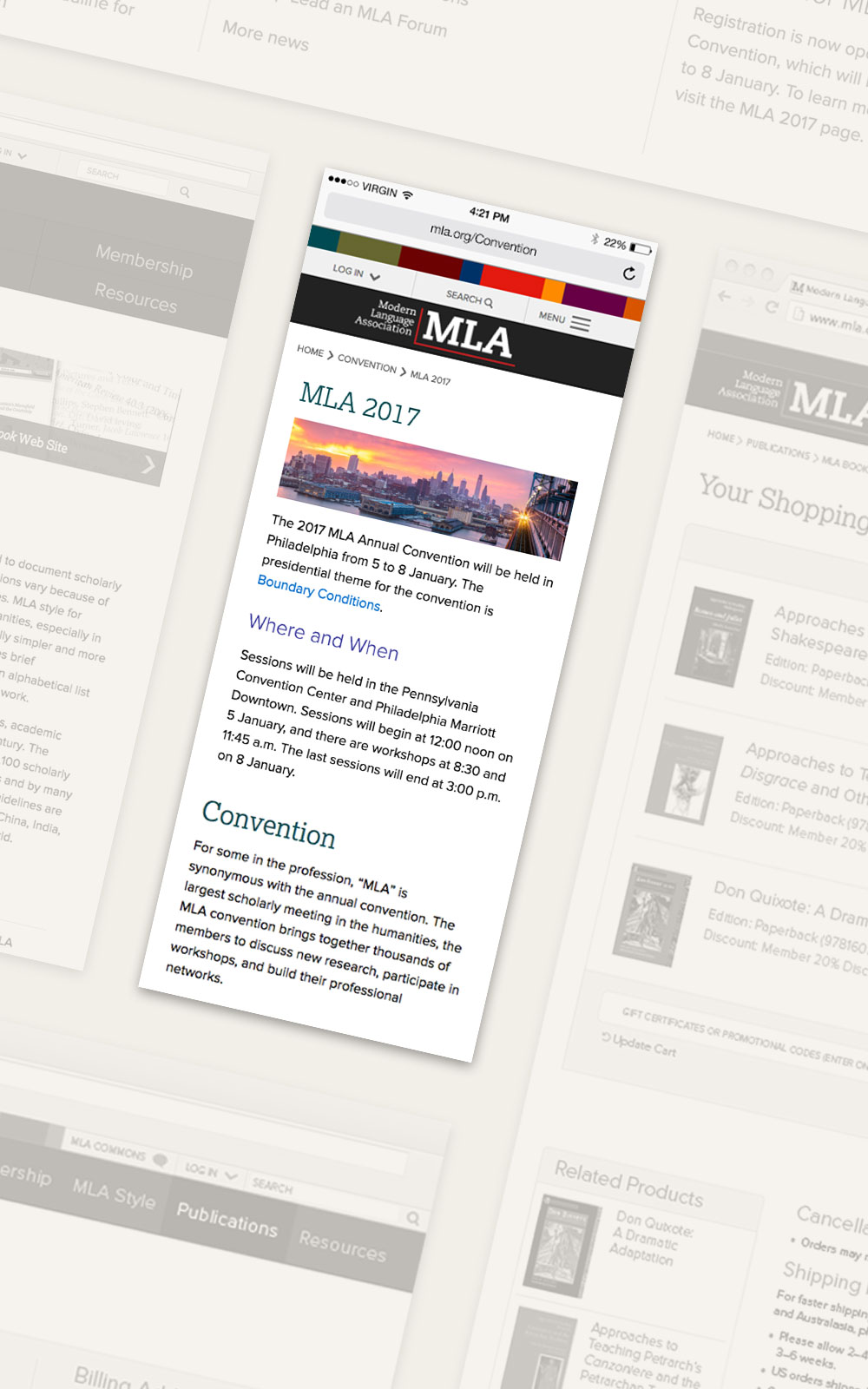
User Experience
The users’ interaction and experience with the site informed all of the decisions I made regarding the design. The wireframing and content strategy were taken care of by other members of the team while I focused initially on the overall look and feel of the site. After the general design patterns and styles were established, we began to focus on smaller components and on how users would interact with them. The site’s accessibility was also an important factor, and all of the colors and type sizes chosen are in accordance with WCAG. We spent a lot of time perfecting the interactions and flow of the navigation, content boxes, search filters, bookstore transactions, and calendar.
Every step of the e-commerce process was thoughtfully considered in order to promote conversions and reduce friction. On the main bookstore page we added a faceted search sidebar box and organized the main content by categories to encourage discovery. As a user adds items to the cart, the number updates on the cart button for a visual reinforcement that an item is added successfully. Upon navigating to the cart page, the options to change the quantity, continue shopping, or continue on to checkout are easy to find and manipulate.
We were successful in simplifying the checkout by grouping and organizing the input boxes and reducing the number of screens it takes to complete the process. We made sure that along the way it would be easy for users to make changes to their order; we also added visual cues to promote a sense of security.
We focused on perfecting the interactions and user flow of the navigation, content boxes, search filters, bookstore transactions, and calendar.

User Interface
The UI components that I found most interesting to work on were the sidebar content boxes, an area of the site where users can interact and connect more personally with the content. The content boxes contain a lot of key dynamic information, like the local navigation, calendars, social media feeds, and the faceted search filters for the bookstore. Thanks to the styles I set up for various design patterns on the site, all of these elements work cohesively while each serving a distinct purpose.

Visual Design
By kicking off this project with style tiles, I was able to identify the color palette, typefaces, and simple design patterns early on, then quickly move on to iterate the design of the homepage. A color bar is used as a supporting graphic of the site, and each color represents an affiliated website that falls under the umbrella of the MLA. Aside from this pop of color and the spare use of color in buttons and headers, other elements are styled in black and grays to unify the look of the site as a whole while allowing important areas to stand out. The content of the homepage was greatly pared down from the old site, allowing me to declutter the space and set up a visual hierarchy.

The mission statement of the organization and purpose of the site are the focus of the homepage, and the viewers’ attention is immediately drawn to the large type and photographic actionable buttons.

The style of the interior pages and many levels of typography were set next, followed by the responsive design of all pages. The most challenging aspect of the responsive design was setting up the main navigation menu so that it allowed for varying sizes and a touch screen. We came up with an elegant solution of stacking the menu items into rows for tablet-sized screens before eventually transitioning to a hamburger menu.
